Brand identity and tone of voice
Brand identity and tone of voice help to define how a brand thinks, speaks and behaves out in the real world. I help brands find that identity and articulate it clearly, translating values, strategy and insights into practical guidelines that teams can use.
My approach to brand identity and tone of voice
I always start with finding the truth behind a brand. There’s no point trying to build an identity on values, thinking and behaviour that doesn’t reflect the core of the brand.
Through research, conversations, workshops and data, I discover what’s real about the brand, and start thinking about how to express it in a practical, repeatable way.

MINDBODY – connecting with the UK audience
The challenge: When MINDBODY first came to the UK from the US, it needed a tone and voice that would resonate locally. It couldn’t sound just like a generic American brand, it needed to connect with UK people living their UK lives. The energy and motivations over here were very different to those ‘over there’.
The thinking: To solve this, I went beyond just a standard UK-specific tone of voice guide. I wanted the US team to understand the mindset of the people they were reaching out to when they first saw MINDBODY messaging. I wanted to put them in the shoes of the audience, whether they were scrolling their social feeds, walking past ads or engaging with the launch campaign digitally.
The outcome: The work ensured that MINDBODY UK’s communications were locally authentic, emotionally engaging and aligned with the overall brand strategy. I wrote:
A comprehensive tone of voice guide, including brand values, style and behavioural principles for UK audiences
Audience personas and five interlocking narrative stories that showed how messages would fit into different people’s lives

Sano – challenging health-food expectations
The challenge: Sano wanted to shake up the health-food market by empowering people with practical nutritional knowledge, while also selling delicious food. The goal was to create a brand identity that clearly communicated a revolutionary approach that would stand out in a crowded market.
The thinking: The visuals explored the intersection of scientific insight and a passion for food, expressed in a dual visual identity that paired freshness with geometric patterns. Strategically we knew that Sano needed a voice that could cut through the standard health-food messaging with energy and passion, but also authority.
The outcome: I defined Sano’s voice, tone and communication approach through a series of tools:
A manifesto that set the philosophical foundation for the brand and gave readers an instant taste of the Sano tone
A detailed tone of voice guide that outlined language, style and behaviours
A framework for internal and external messaging, ensuring consistent use of the brand’s principles across all touchpoints
Manifesto
This manifesto set the foundation for how Sano spoke internally and externally, defining its belief-led, science-first approach to food and wellbeing. It helped to energise the internal team, and let the audience know that it had found the health-food challenger it was looking for.
This is where your life changes: where a passion for food and health meets nutritional science. The result is a radically new approach to eating and wellbeing, one based on facts, not fads and one that puts the knowledge of how to eat and live better in your hands. It all starts with a fresh way of thinking.
Join the nutrition revolution.
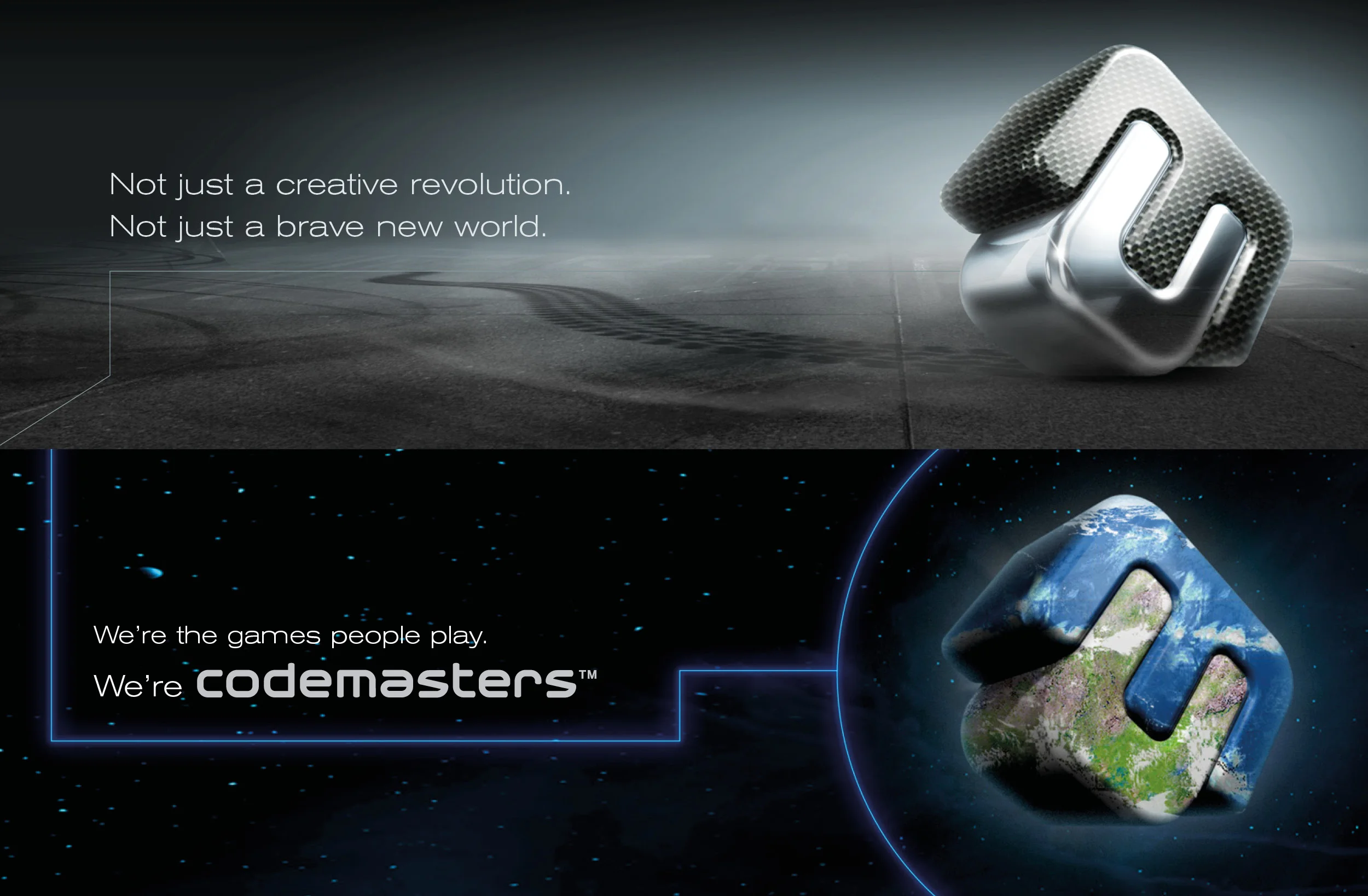
Codemasters – redefining a gaming giant
The challenge: Codemasters was rebranding. As one of the games industry’s original powerhouses, the rebrand needed to demonstrate that Codemasters was still on the cutting-edge in its thinking.
The thinking: With the strategic thinking and design working hand in hand, we believed the brand should feel alive, representing the creativity and energy of gaming. At the centre of this thought was the idea for an ever-changing logo – sometimes serious, sometimes playful, always what was right.
My job was to define what was possible with these two personalities. Spoiler: everything was possible!
The outcome: The answer was two brands in one: work and play. The logo was made of two interlocking pieces (the C and the M) that could adapt to fit the situation and the rest of the flexible brand was built around that concept. I defined the rules and wrote the guidelines, and we also rendered some example idents to show the team what they could do. The new brand encouraged the creative people at Codemasters to take it on, as we asked ‘Where do we go next?’